Vedantu Design System
Scaling edtech with 40% faster rollouts through a unified design system
Background
This case study captures how we built the Vedantu Design System to streamline processes, enhance learning experiences, and support scalable growth.
My Role
I juggled feature design work while leading a 2-person design team on the design system initiative.
Design Advocate: Gained stakeholder support, ensured team communication, and drove implementation.
Our team was doing all it could to stay on top of monthly deliverables, and our capacity was maxed. Hiring dedicated designers to do the job was not an option and hence we had to make time by taking on fewer deliverables each month.
Visual Design: Built component libraries for easy team contribution, then shifted focus to the design system.
Process: Collaborated with front-end development to understand challenges. The design system began as a series of components and guidelines grouped into specific categories.
Design System Management: Creating and maintaining clear standards and guidelines for system usage.
Tools
Figma: Where we designed all component and pattern libraries and built prototypes to demonstrate interactive elements.
Storybook: Where we housed all of our documentation and usage guidelines.
Challenge
As Vedantu expanded offerings in live learning and test prep (JEE, NEET, school curriculums), stylistic issues emerged. Colors and fonts lacked definition; component handling differed page-to-page. Rapid product iterations, inconsistent UI patterns, and a growing need for accessibility in education platforms underscored the necessity of a design system.
Goals
- Consistency: Create a unified design language across platforms
- Scalability: Facilitate rapid feature development and design handoff
- Inclusivity: Ensure accessibility for students of varying needs and backgrounds
- Engagement: Support interactive learning with visually engaging, intuitive interfaces
Impact
Within six months of its introduction, the Vedantu Design System was adopted by over 90% of developers and designers in our organisation.
Re-usable components and design patterns reduced the design to implementation by 40%, improving our product development cycle.
Design system guidelines ensured consistent UX across products, enhancing brand identity.
Consistent look and improved usability earned high appreciation from students.
Key InsightThe new Design System reduced redundancy in our design process, saving up to 40% in time and resources. It also led to the reduction of onboarding time for new designers and developers by 60%.
Getting Started
Interface Inventory
Conducted audit of existing designs across mobile and web platforms. The purpose of this was to collect a visual inventory that documents inconsistencies and defines the essential design patterns and elements.
Market Research
Analyzed interface inventory, reviewed external design systems (IBM Carbon, Atlassian, Skyscanner Backpack). Defined three system parts: Foundations, Components, Page Templates.
Accessibility
As one of our core design principles, accessibility was top of mind from the start. We built this system to meet and exceed the accessibility standards outlined in the Web Content Accessibility Guidelines (WCAG). Pressure-tested for Level AA and AAA compliance. Focused on color contrast ratios, input feedback, content accessibility.
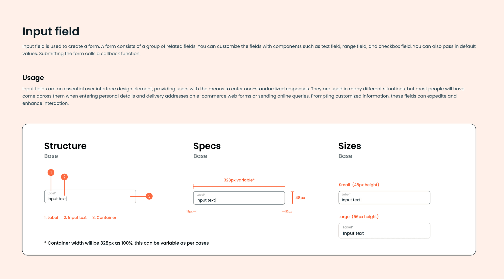
Structure
Foundations
System basics with brand-specific visual elements:
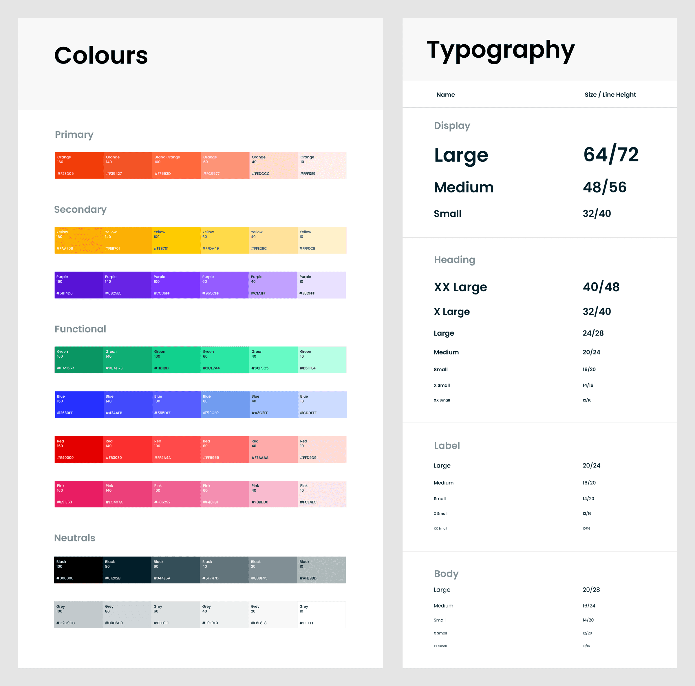
- Colour
- Typography
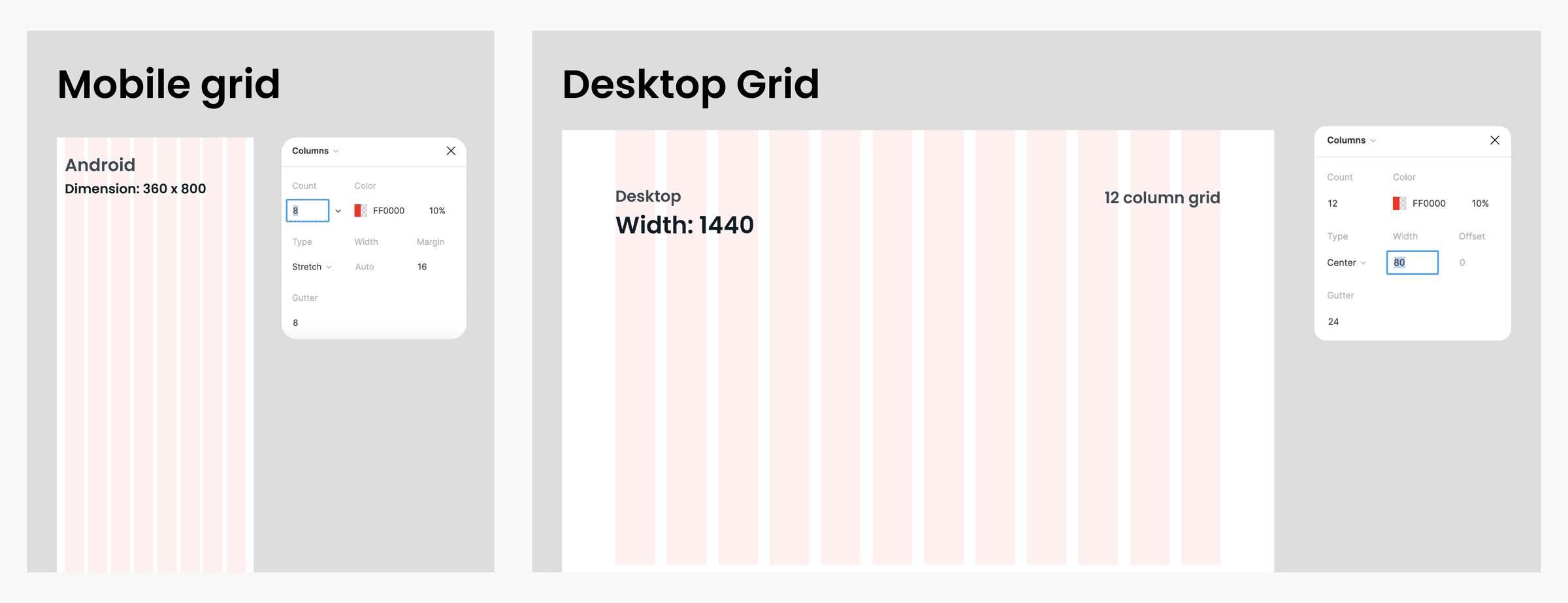
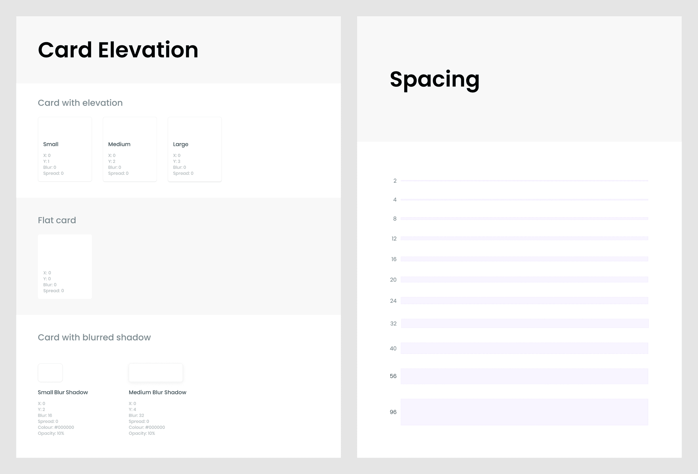
- Spacing
- Grid Systems
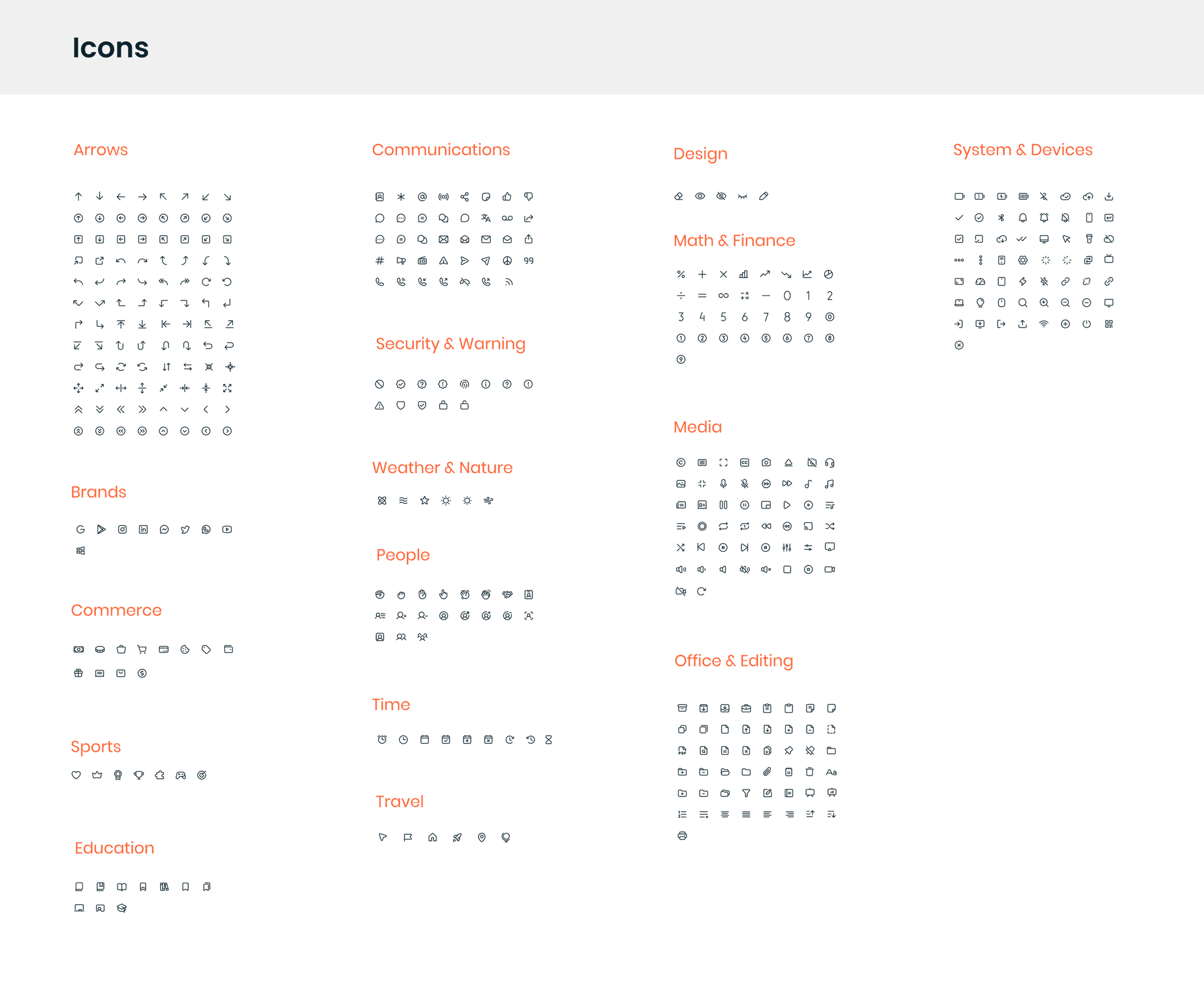
- Icons
- Elevation/Shadows
Aligning on and adhering to Foundations enabled teams to achieve visual coherence and seamlessness across the board.
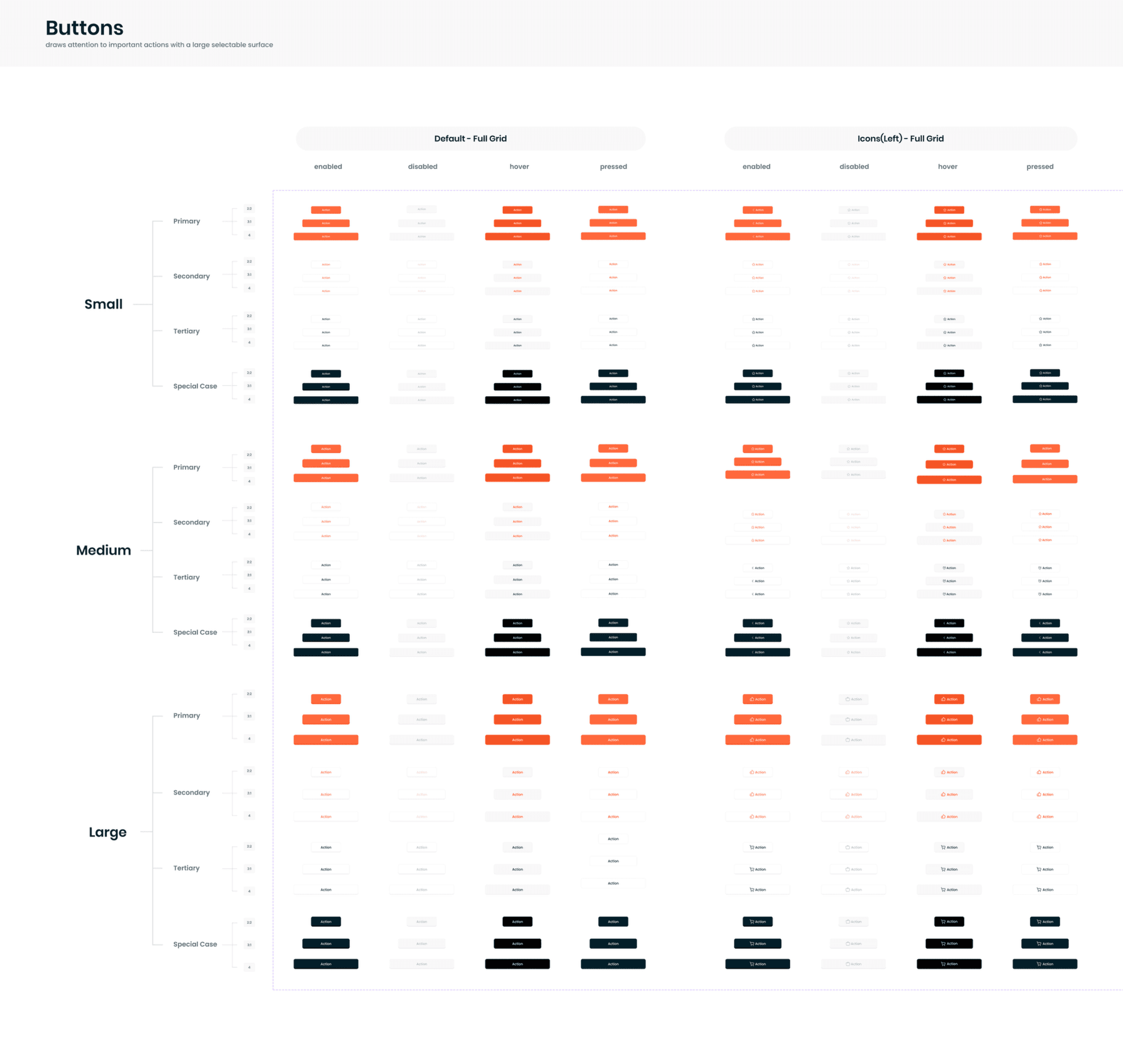
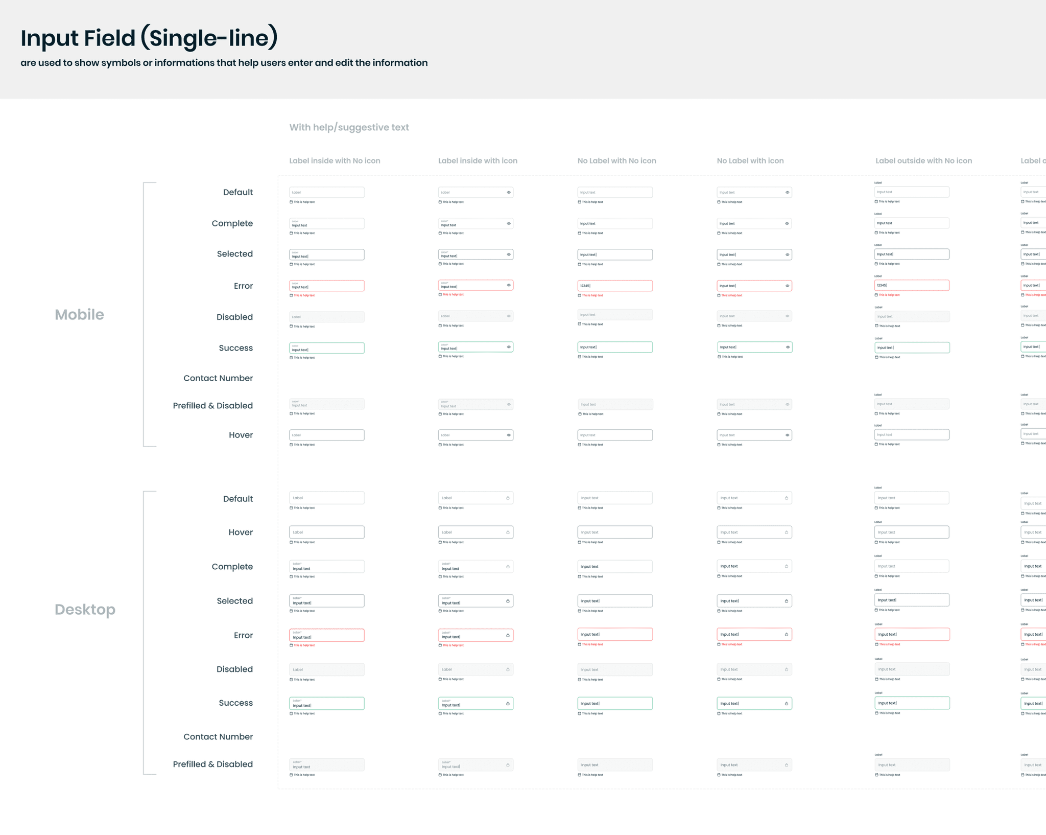
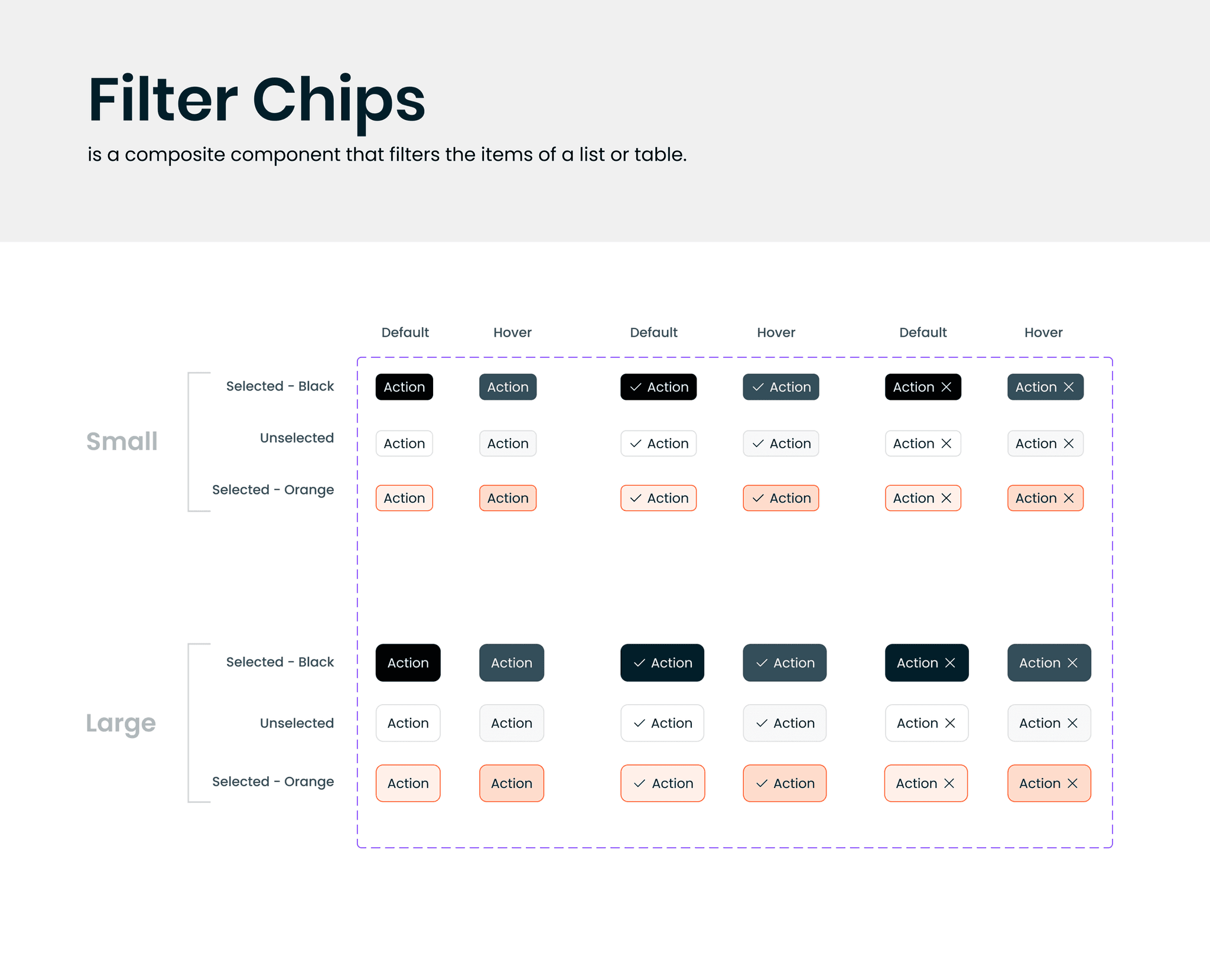
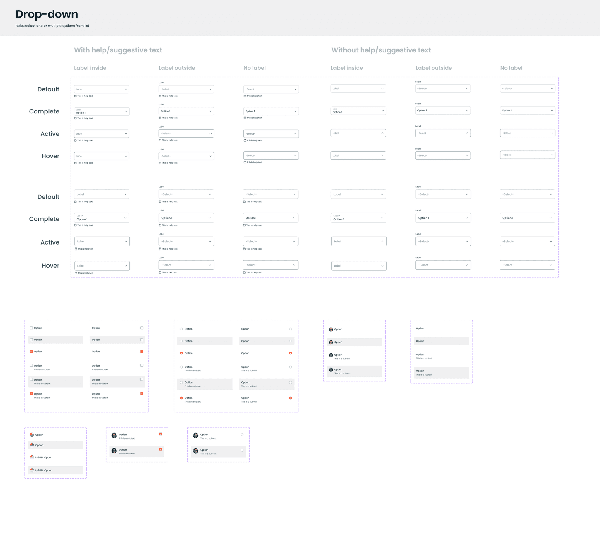
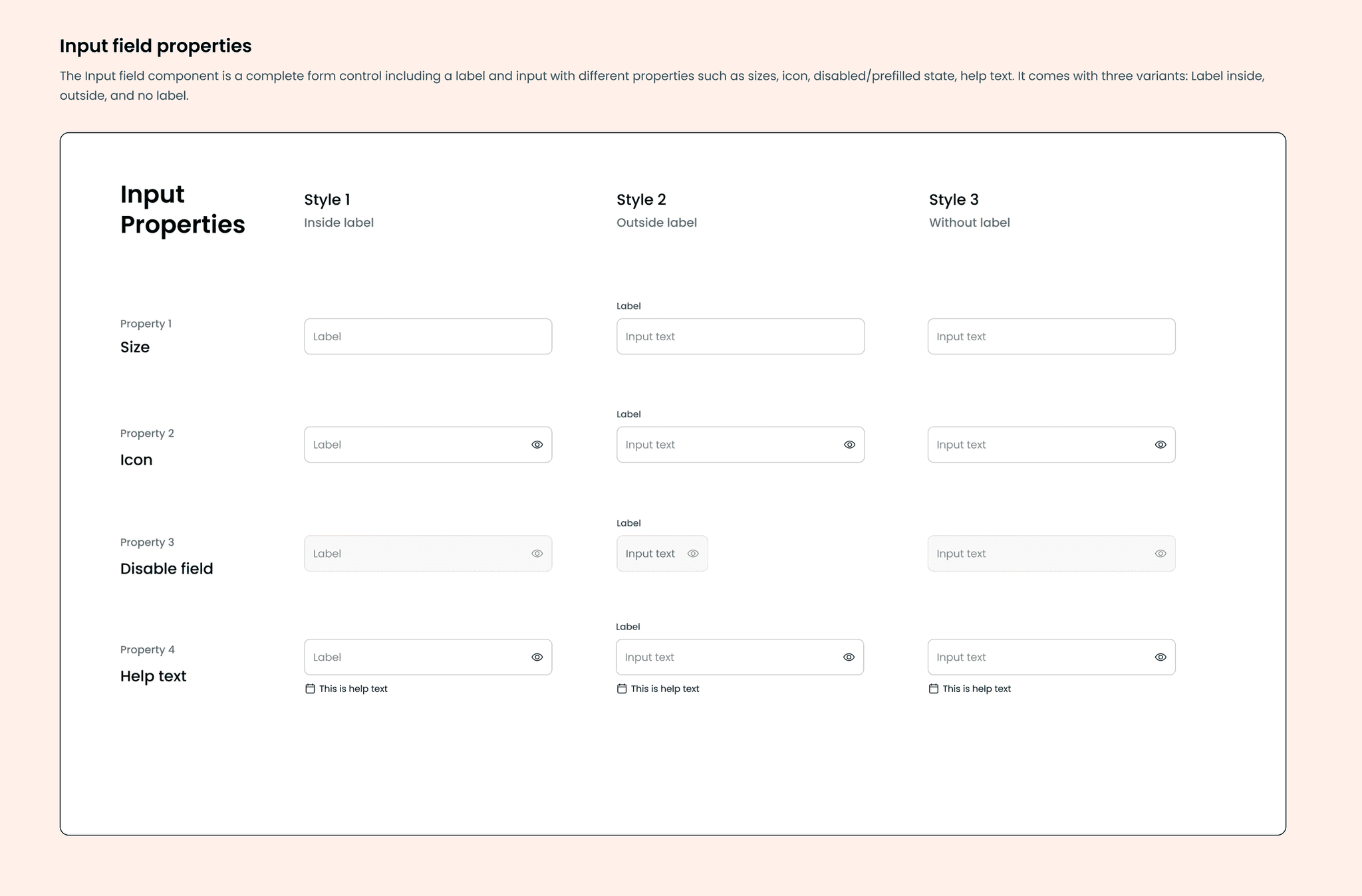
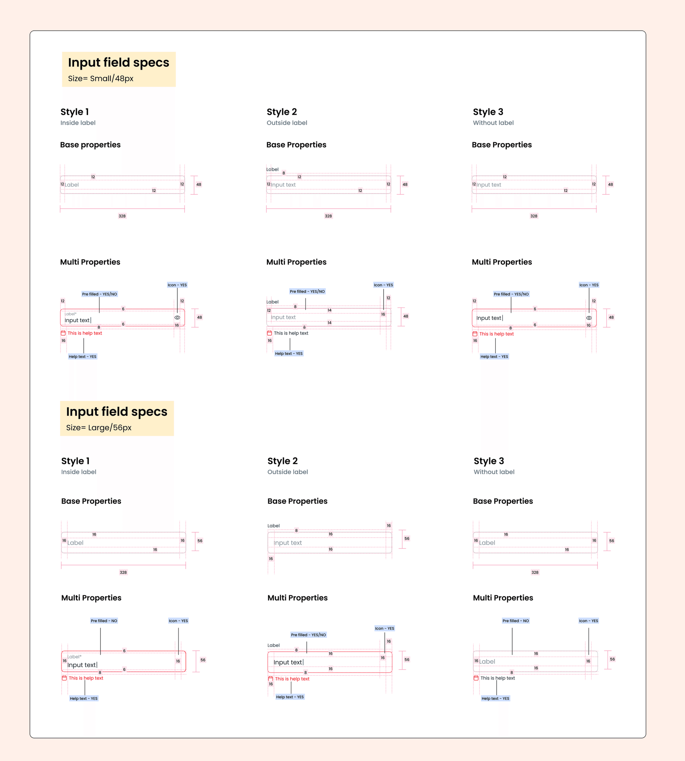
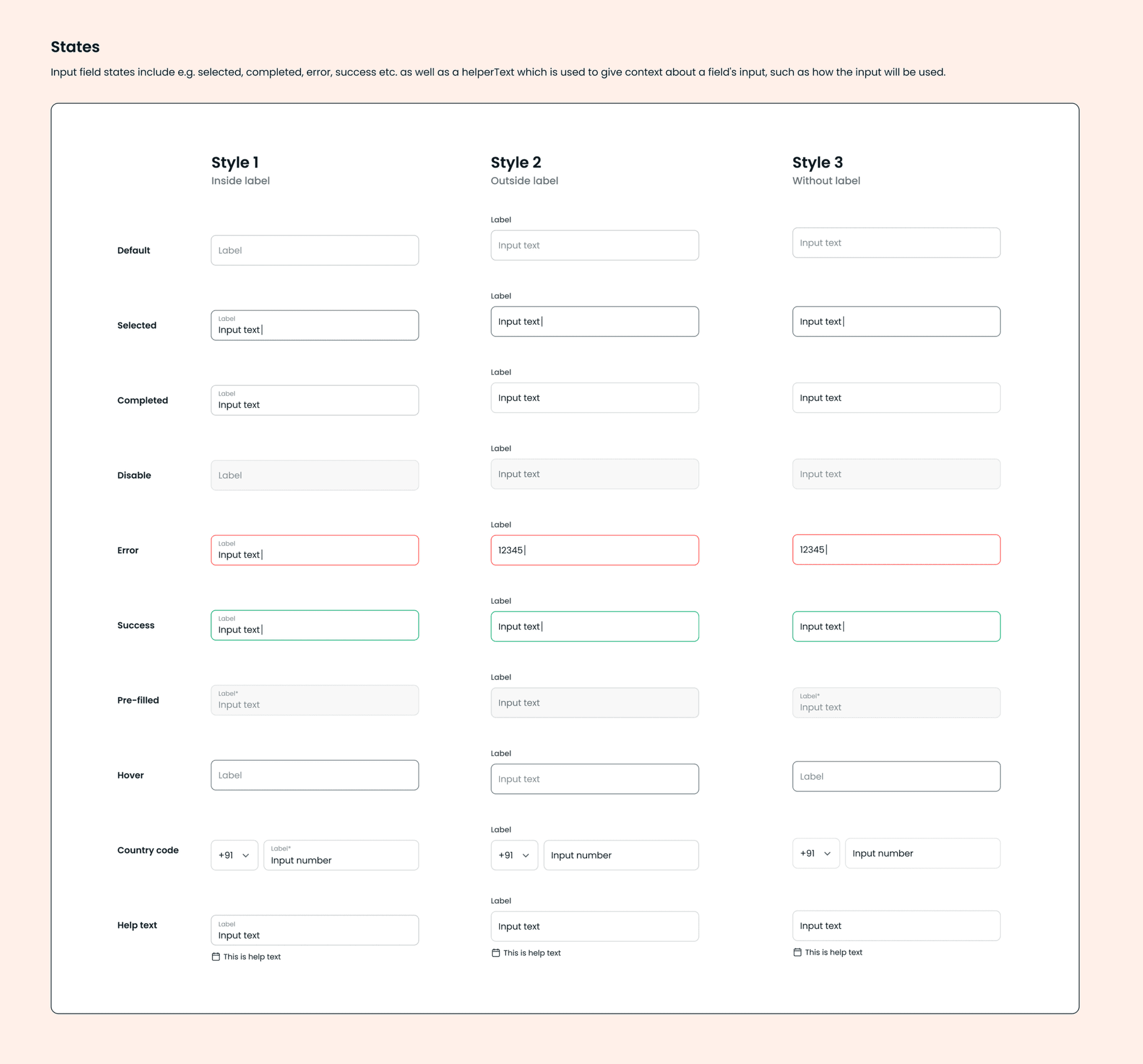
Components
We worked on UI elements (buttons, form fields, etc.) based on our findings. Then worked on the UI elements which could come to use in the future projects based on our team's inputs.
Each component had thorough documentation, specifying interactive states, minimum and maximum content, additional breakpoints, tab stops, and more.
Documentation
After defining Foundations, Components, and Page Templates, we ensured proper documentation and governance.
We created and maintained documentation resources in Storybook, working closely with our team to ensure we met their specific needs. The documentation included:
- Design principles
- Quick start guides
- Component usage and guidelines
We rolled out the system incrementally, starting with the most frequently used components to maximise impact.
We followed the same structure for all component library guidelines.
Evangelization, Feedback, and Iteration
A key responsibility was socializing the design system with stakeholders and teams. It was important to articulate the design system benefits in various contexts and provide team-specific resources to improve their workflows and processes.
When presenting to leadership, we focused on demonstrating and quantifying the cost of inefficiencies and how implementing a design system would enable us to meet business goals faster and lower costs.
We held feedback sessions with pod-specific teams for firsthand assessment of working and non-working elements. We also worked closely with our development partners to implement changes to evolve and improve upon the system.
Key InsightMy goal was to anticipate the needs of various teams and provide resources that show how the design system can alleviate their specific pain points.
Key Takeaways
Being flexible: While the design system improved workflows, initial adoption was challenging and teams needed training to fully utilise the system.
Living system: They require a dedicated team actively involved in their growth and maintenance. Getting buy-in from cross-functional teams and driving system adoption are worthwhile challenges.
Collaboration: To evolve the design system, it is critical to connect with fellow members of the design team and understand the changes required to improve the system.
Conclusion
The Vedantu Design System not only streamlined internal processes but also transformed the learning experience for students and teachers alike.
By prioritizing consistency, scalability, and inclusivity, we built a system that supported Vedantu's mission of making quality education accessible to all. It continues to evolve, driving engagement and innovation in online education.